User experience (UX) is crucial for successful eCommerce conversions. When your website offers a seamless, user-friendly, and enjoyable experience, visitors are more likely to make purchases and come back for future shopping. On the other hand, poor UX leads to friction, confusion, and frustration—all of which drive customers away.
Common UX mistakes that hurt your eCommerce conversions often go unnoticed but can result in significant revenue loss. These mistakes include confusing layouts, unclear calls-to-action, slow loading times, and designs that aren’t mobile-friendly. By identifying and fixing these typical eCommerce UX errors, you can greatly improve your site’s performance.
This article discusses the main UX problems that impact sales and offers practical solutions you can implement right away to boost eCommerce conversions. By understanding these bad UX examples that eCommerce professionals encounter, you’ll gain the knowledge needed to optimize your site effectively and turn visitors into loyal customers.
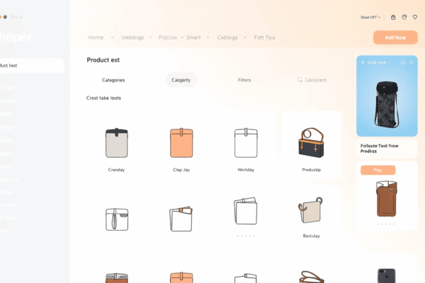
1. Overwhelming Users with Choices
Presenting too many options to users can lead to choice overload, causing confusion and decision fatigue. Users may feel overwhelmed and struggle to make a purchase decision when faced with an excessive array of choices.
Practical Tips to Avoid Overwhelming Users
To avoid overwhelming users:
Limit the number of options presented on each page to prevent choice paralysis.
Implement filters and sorting features to help users narrow down their selections based on preferences.
Use clear categorization and product organization to streamline the browsing experience.
By simplifying the product offerings and guiding users towards a more focused decision-making process, you can reduce choice overload and enhance the overall user experience.
2. Ignoring Mobile Optimization
In today’s eCommerce world, having a mobile-friendly site is more important than ever. With the rise of smartphones and tablets, more and more people are shopping online using their mobile devices. In fact, studies show that over half of all online traffic now comes from mobile devices.
This shift in consumer behavior means that if your online store isn’t optimized for mobile, you’re likely missing out on a significant number of potential customers. Here are some reasons why mobile optimization is crucial for your eCommerce business:
High Bounce Rates: When users visit your website on their mobile devices and find it difficult to navigate or read, they’re likely to leave immediately and go to a competitor’s site instead. This results in high bounce rates, which can negatively impact your search engine rankings.
Lost Sales Opportunities: If your website isn’t mobile-friendly, potential customers may abandon their purchases or choose not to buy from you at all. According to research, nearly 70% of shoppers say they are more likely to make a purchase from a retailer with a mobile-friendly website.
To avoid these consequences, it’s essential to prioritize mobile optimization for your eCommerce site. Here are some key strategies to consider:
Responsive Design: Implement a responsive design that automatically adjusts the layout and content of your website based on the screen size of the device being used. This ensures a seamless browsing experience for all users, regardless of whether they’re on a desktop or mobile device.
Fast Loading Speed: Optimize your website’s loading speed on mobile devices by compressing images, minimizing code, and leveraging browser caching. Slow-loading pages can frustrate users and lead them to abandon your site.
Mobile-Friendly Navigation: Simplify your navigation menu and make it easy for users to find what they’re looking for on their mobile devices. Consider using dropdown menus or hamburger icons to save space and create a cleaner design.
By implementing these strategies and prioritizing mobile optimization, you can provide a better user experience for your customers and increase your chances of converting them into paying buyers.
3. Slow Load Times
Page speed directly affects user experience and plays a critical role in your eCommerce site’s success. When loading speed lags, visitors quickly lose patience, increasing bounce rates and reducing conversions. Search engines like Google also factor loading speed into their rankings, meaning slow websites get less visibility and fewer organic visitors.
Common issues that slow down your site include large image files, excessive scripts, and poor server response times. Addressing these through effective loading speed optimization techniques can dramatically improve performance:
Image compression: Reduce file sizes without sacrificing quality to ensure faster image rendering.
Browser caching: Store static resources locally so returning users experience quicker load times.
Minifying code: Remove unnecessary characters from HTML, CSS, and JavaScript files to speed up downloads.
Content Delivery Networks (CDNs): Distribute content closer to users geographically for faster access.
Optimizing page speed is one of the most impactful UX improvements you can make in website design. It prevents frustration, keeps users engaged, and supports higher eCommerce conversions by delivering a smooth shopping experience.
4. Poor Navigation Structure
A clear and intuitive navigation system is essential for helping users quickly locate products or information. When visitors can effortlessly find what they need, their chances of completing a purchase increase significantly. Confusing or cluttered menus frustrate users, causing them to leave before converting.
To create a user-friendly design, consider these best practices:
Use descriptive labels: Menu items should clearly communicate what users will find, avoiding vague terms like “Products” if more specific categories are available.
Organize categories logically: Group related items together in a hierarchy that matches how customers think. For example, separate “Men’s Shoes” from “Women’s Shoes” rather than lumping all footwear into one category.
Limit menu depth: Avoid too many nested submenus; keep the structure shallow to reduce cognitive load.
Include a search function: Allow users to bypass navigation by searching directly for products or topics.
An effective navigation menu acts as a roadmap for your site, guiding users smoothly toward their goals and boosting conversion rates.
5. Lack of Clear CTAs
Calls-to-action (CTAs) are essential elements of any eCommerce website. They serve as guides for users, directing them towards making a purchase or taking a desired action. Without clear and compelling CTAs, potential customers may feel lost or unsure about what steps to take next, leading to missed opportunities for conversion.
The Importance of Well-Placed CTAs
CTAs should be strategically placed throughout your website to maximize their effectiveness. Here are some key areas where you can incorporate CTAs:
Homepage: Use a prominent CTA on your homepage to encourage visitors to explore your products or make a purchase.
Product Pages: Include persuasive CTAs on each product page, such as “Buy Now” or “Add to Cart,” to prompt users to take action.
Checkout Process: Optimize your checkout process with clear CTAs that guide customers through each step and reassure them about their purchase decision.
Examples of Effective CTAs
To inspire your own CTA strategy, here are some examples of effective calls-to-action that have been proven to drive conversions:
“Get 20% Off Your First Order” – This CTA creates a sense of urgency and offers an incentive for users to make a purchase.
“Shop the Sale” – A straightforward and direct CTA that encourages users to explore discounted products.
“Join Our Loyalty Program” – This CTA appeals to repeat customers by promoting exclusive benefits and rewards.
Remember, the key is to make your CTAs clear, specific, and action-oriented. Experiment with different wording and designs to see what resonates best with your audience.
6. Neglecting Microinteractions
Microinteractions are the small, subtle animations and design elements that occur in response to user actions. These can include button animations, hover effects, loading animations, and more. While they may seem insignificant at first glance, these interactive design elements play a crucial role in enhancing the overall user experience.
The Power of Microinteractions
When implemented thoughtfully, microinteractions can:
Create a sense of delight: A well-timed animation or playful effect can bring a smile to a user’s face and make their experience more enjoyable.
Provide feedback: Microinteractions can communicate to users that their actions have been recognized and understood. For example, a button animation confirming a successful purchase can reassure customers that their order has been processed.
Guide users: Subtle animations can draw attention to important elements or guide users through specific tasks. For instance, a loading animation indicating that content is being fetched can keep users engaged while they wait.
Examples of Successful Microinteractions in eCommerce
Several eCommerce platforms have successfully leveraged microinteractions to engage customers and improve conversions:
Amazon’s Add to Cart Animation: When users add an item to their cart on Amazon, a smooth animation plays, showing the product seamlessly transitioning into the cart icon. This microinteraction not only provides visual confirmation but also reinforces the idea that the item is now saved for later.
Airbnb’s Search Result Loading Animation: While searching for accommodations on Airbnb, users are greeted with a playful loading animation featuring animated illustrations of various properties. This delightful microinteraction keeps users entertained during the wait time and builds anticipation for the search results.
Zalando’s Swipe-to-View Feature: Zalando, an online fashion retailer, incorporates swipe gestures as part of its product viewing experience. When users swipe left or right on an image, a smooth transition effect occurs, making it feel like they’re flipping through pages of a magazine. This interactive element adds an element of surprise and encourages customers to explore different angles of products.
By incorporating similar microinteractions into your eCommerce website or app, you can create memorable experiences that resonate with your customers and drive conversions.
7. Complicated Checkout Processes
One of the biggest reasons for cart abandonment is a complicated checkout process. If your checkout process is lengthy, confusing, or requires too many steps, customers are likely to abandon their carts and look for alternatives.
Streamline Your Checkout Process
To minimize friction and reduce cart abandonment rates, it’s crucial to streamline your checkout process. Here are some strategies you can implement:
Simplify the Form Fields: Only ask for essential information such as name, email address, and shipping address. Avoid asking for unnecessary details that may deter customers from completing their purchase.
Offer Guest Checkout Options: Many customers prefer not to create an account when making a purchase. By offering a guest checkout option, you can cater to these customers and increase your chances of conversion.
Incorporate Progress Indicators: Reassure users during their purchase journey by incorporating progress indicators. This will give them a sense of how far along they are in the process and encourage them to complete their purchase.
By implementing these strategies, you can create a seamless checkout experience that encourages customers to complete their purchases.
8. Poorly Optimized Forms
Optimizing form fields for usability can significantly improve completion rates, leading to more successful transactions.
Practical Tips for Designing User-Friendly Forms
Use clear labels: Make sure each form field has a descriptive label that clearly explains what information is required.
Choose appropriate input types: Select the most suitable input type for each field, such as text boxes, drop-down menus, or checkboxes, to make it easier for users to enter their information.
Group related fields: Organize your form by grouping related fields together, making it more intuitive for users to fill out.
Provide error messages: If a user makes a mistake while filling out the form, provide clear and specific error messages to help them correct it.
Keep it simple: Only ask for essential information and avoid overwhelming users with too many fields.
9. Content Quality and Trust Factors in eCommerce
In the world of eCommerce, first impressions matter. When potential customers land on your website, they should be greeted with visually appealing product images or videos that showcase your items in the best light possible. These visuals play a crucial role in enhancing the perceived value of your products and can significantly influence a customer’s decision to make a purchase.
The Power of Visuals
High-quality images or videos have the ability to convey information that words alone cannot. They allow customers to see every detail of the product, from its texture to its color, and get a better understanding of what they’re buying. This is especially important for items like clothing or accessories where fit and style are key factors in the purchasing decision.
The Importance of Information
While visuals are important, they should always be accompanied by informative descriptions. A well-written product description can provide additional context and highlight features that may not be immediately apparent in the images or videos. It gives customers a deeper understanding of what makes your product unique and why it stands out from competitors.
Building Trust with Accuracy
Accurate details about your products are essential for building trust with potential buyers. If you claim that a dress is made from 100% silk but it turns out to be polyester when they receive it, you’ll likely face returns and negative reviews. To avoid such situations, make sure to double-check all information before publishing it on your website.
Addressing Customer Queries
Even with detailed descriptions, there may still be questions that potential buyers have about your products. This is where FAQs come into play. By proactively addressing common customer queries through an FAQ section on your website, you can instill confidence in potential buyers and reduce any hesitations they may have about making a purchase.
Remember, content quality goes hand-in-hand with trust factors in eCommerce. By investing time and effort into creating high-quality visuals, informative descriptions, accurate details, and addressing customer queries, you can create an online shopping experience that not only attracts but also converts visitors into paying customers.
Transparent Shipping Costs & Return Policies
Content quality goes beyond just images and videos quality or product descriptions. It also plays a vital role in building trust with customers, directly influencing their buying decisions. One critical area often overlooked is shipping transparency and return policy clarity.
Shipping Transparency
Customers expect to see all costs upfront. Hidden shipping fees or unclear delivery timelines create frustration and often lead to cart abandonment. Display shipping costs clearly on product pages or during checkout—this avoids unpleasant surprises at the final step.
Clear Return Policies
Return policies must be straightforward and easy to find. Complex procedures or vague terms cause hesitation. Outline key points such as:
Eligibility for returns/exchanges
Timeframe for returns
Condition requirements for returned items
How refunds are processed
A clear return policy reassures customers their purchase is risk-free, encouraging them to complete transactions confidently.
These elements work hand-in-hand with FAQs that address common shipping and return questions, preventing confusion and reducing customer support inquiries. Transparent practices not only improve user experience but also enhance your brand representation by showing honesty and respect for your customers’ concerns.
Building this level of trust through clarity prevents one of the most damaging UX mistakes that are killing your eCommerce conversions: lack of transparency around costs and policies.
Up-selling/Cross-selling Strategies
Up-selling and cross-selling are powerful techniques that go beyond simply increasing average order value. When executed with care, they enrich the customer experience by presenting relevant complementary items or upgraded options at key moments in the buyer’s journey.
Key factors to keep in mind:
Relevance: Suggestions should be tailored to match the user’s interests and current selections. Irrelevant offers can feel intrusive and damage trust.
Tasteful Presentation: Avoid aggressive sales tactics. Instead, integrate product recommendations naturally within the flow of browsing or checkout.
Visual Appeal: High-quality images and videos strengthen brand representation and help customers visualize how additional products fit into their needs.
Content Quality: Clear, concise product descriptions and informative FAQs support these recommendations by addressing potential questions and reducing hesitation.
These strategies serve as value additions rather than pushy sales pitches. They enhance engagement without overwhelming shoppers, helping to guide decisions while reinforcing brand credibility.
Conclusion
Avoiding UX Mistakes That Are Killing Your eCommerce Conversions requires careful attention to key areas:
Simplify choices to prevent user overwhelm
Prioritize mobile optimization for wider reach
Enhance site speed to reduce bounce rates
Design clear navigation that guides users effortlessly
Use compelling CTAs to drive actions
Incorporate microinteractions that engage and delight
Streamline checkout processes to minimize friction
Optimize forms for ease of completion
Provide high-quality visuals, detailed product info, and transparent policies
By mastering these elements, you can transform your eCommerce platform into a conversion powerhouse, turning visitors into loyal customers.
FAQs (Frequently Asked Questions)
How does UX impact eCommerce conversions?
User Experience (UX) plays a crucial role in driving eCommerce conversions by influencing how easily and pleasantly customers can navigate, find products, and complete purchases. Poor UX can hinder sales by causing confusion, frustration, or abandonment, while good UX facilitates decision-making and builds trust.
What are the consequences of overwhelming users with too many product choices?
Presenting too many options leads to choice overload and decision fatigue, which confuse users and delay or prevent purchase decisions. Simplifying product offerings and guiding users through curated selections helps reduce indecision and increase conversion rates.
Why is mobile optimization essential for eCommerce websites?
With an increasing number of shoppers using mobile devices, having a mobile-friendly and responsive design is vital. Neglecting mobile optimization can result in high bounce rates, poor user experience, lost sales opportunities, and lower search engine rankings.
How do slow load times affect eCommerce sales and SEO?
Slow website loading speeds negatively impact user experience by causing frustration and abandonment. Additionally, search engines rank faster sites higher, so optimizing page speed through techniques like image compression and browser caching improves both sales conversions and SEO performance.
What role do clear calls-to-action (CTAs) play in improving eCommerce conversions?
Well-placed and compelling CTAs guide users toward desired actions such as making a purchase or signing up for offers. Clear CTAs reduce confusion, create urgency, and enhance conversion-oriented design by directing customer behavior effectively on eCommerce platforms.
How can transparent shipping costs and return policies build trust with online shoppers?
Being upfront about shipping charges and providing clear return/exchange guidelines manage customer expectations realistically. Transparency in these areas reduces hesitation related to hidden fees or complicated procedures, thereby enhancing buyer confidence and encouraging completed purchases.


Leave a Reply
You must be logged in to post a comment.