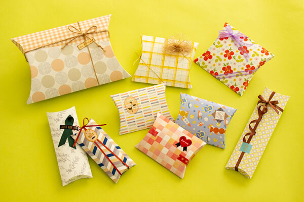
Color has a silent language that speaks to the eyes and emotions. It can influence how people feel, decide, and even remember things. When used well, color can make packaging more attractive and meaningful. This is especially true for products like custom pillow boxes, where color helps create a lasting impression.
Understanding The Basics of Color Psychology in Packaging
Colors affect how customers think and feel. Some colors calm the mind, while others spark excitement. This science of how colors influence human behavior is known as color psychology. It’s important to understand this when designing packaging for any product. Choosing the right color can build trust or drive customers away.
For example, blue often represents trust and calmness. That’s why many brands use it for professional or medical products. Red, on the other hand, creates energy and draws attention. People often associate it with love, urgency, or passion. For custom packaging, knowing these differences can give businesses an edge.
When a shopper picks up a product, color is often the first thing they notice. It might remind them of a feeling, an event, or even a smell. This quick connection can be powerful. If brands want customers to remember them, colors help create that memory. Also, different cultures interpret colors differently. In some places, white means purity, while in others, it can represent mourning. So, businesses should research their audience’s background before choosing a color scheme.
Using color psychology in packaging also helps businesses stand out on crowded shelves. Imagine a store with dozens of similar products. A well-chosen color can attract the eye and make customers pause. This pause is sometimes all a brand needs to win a new buyer.
Emotional Triggers of Color Combinations
Combining colors is just as important as choosing single shades. The right mix can create strong feelings and guide customers’ reactions. Color combinations shape the mood of a package. They help brands send clear messages.
For instance, pairing blue with white creates a clean and trustworthy look. Many medical and tech brands use this combo. It feels safe and professional. On the other hand, red and yellow create excitement and urgency. Fast food brands often use this mix because it grabs attention quickly.
Brands should also keep cultural meanings in mind when mixing colors. Some color pairs might look great but have negative meanings in certain regions.
When planning color combinations for packaging, consider these points:
- Pick combinations that match your brand’s story.
- Use one main color and one or two accents.
- Test different color pairs to see how customers react.
For products packed in pillow packaging boxes, smart color combinations can make them stand out on shelves. They also help customers remember the brand. Choosing the right pairs can mean the difference between a sale and a missed chance.
How Warm Colors Boost Brand Energy
Warm colors like red, orange, and yellow are strong tools for creating energy. They make people feel excited, happy, and alert. When used well on packaging, these shades can help products look lively and appealing. However, they should be used carefully to avoid overwhelming the eyes.
Red, for example, makes people think of love, urgency, and passion. It can also increase heart rates and create feelings of excitement. Brands use red to grab attention, especially for items they want people to buy quickly. However, too much red can feel aggressive. Balancing it with other colors is wise.
Orange blends the energy of red and the cheerfulness of yellow. It gives off a friendly and fun vibe. It’s a great choice for brands that want to appear approachable and youthful. It also suggests value, making customers feel they’re getting a good deal.
When applying warm colors in design, keep these points in mind:
- Use warm shades for call-to-action spots, like special offers or logos.
- Balance them with neutral tones like white or grey to avoid visual overload.
- Consider the feelings you want your customers to experience.
For custom packaging like pillow boxes, warm colors can be very effective. They help the product feel lively and unique. Customers often remember brands that spark emotional connections. A touch of warm color can be the secret to leaving a lasting impression.
Cool Colors For Calm and Sophistication
Cool colors like blue, green, and purple bring calm and class to packaging. They give off peaceful and soothing feelings. Many brands use these colors to show trust, nature, or luxury.
Blue is one of the most popular colors in packaging. It suggests trust, stability, and cleanliness. It’s a good choice for products meant to look professional or high-quality. Blue also makes things feel calm. People often choose products with blue packaging because it feels safe.
Green reminds people of nature, health, and freshness. It’s often used for eco-friendly products. If a brand wants customers to think about the environment, green is a strong choice. It also brings feelings of balance and harmony.
When designing with cool colors, remember these tips:
- Cool tones can be great backgrounds, letting brighter colors pop.
- Use deeper shades for a more premium feel.
- Match cool colors with elegant fonts for a polished look.
For products packaged in pillow boxes, cool colors can make them feel luxurious and special. They also create a relaxing shopping experience. Customers who want quality and calm might be drawn to these shades. Cool colors help a brand appear trustworthy and elegant.
The Role of Neutral Colors in Modern Packaging
Neutral colors like white, black, grey, and brown may seem simple, but they hold great power. They bring balance, class, and flexibility to packaging designs. Many modern brands use neutral colors to create a sleek and timeless look.
White often stands for purity, simplicity, and cleanliness. It makes products look fresh and modern. White spaces on packaging also help other colors stand out. This technique makes designs feel open and easy to read.
Black is strong and powerful. It adds mystery and elegance to packaging. Luxury brands often use black to show class and exclusivity. However, too much black can feel heavy or somber, so it’s important to combine it wisely with lighter shades.
Brown connects to earthiness and natural vibes. It suggests honesty and sustainability. Many brands selling organic products choose brown tones for a warm and rustic look.
Neutral colors also offer these advantages:
- They make text and logos easy to read.
- They match well with any other color.
- They keep the design from feeling too busy.
When used on packaging like pillow boxes, neutral colors help products look refined and professional. They’re also timeless, meaning designs stay stylish for years. Customers often link neutral shades with trust and quality.
Colors and Their Connection to Product Types
Different products call for different colors. Choosing the right color depends on the product and its purpose. Color helps show what the product stands for.
Beauty products often use soft pinks, purples, and golds. These colors feel luxurious and gentle. They attract customers who want to feel pampered. On the other hand, health products often stick to greens and blues. These shades feel clean and trustworthy.
Food products use colors that connect to flavors. For example, green suggests mint or freshness, while brown might hint at chocolate or warmth. Brands selling organic foods often use earth tones to highlight natural ingredients.
For gifts, vibrant colors add excitement. Bright reds, purples, or golds can make gift items look special. Meanwhile, luxury products lean towards black, silver, or deep jewel tones for a high-end feel.
The type of product also affects how much color should be used. Everyday products might use simpler designs. Premium products often use fewer colors but with elegant details.
Cultural Influence on Color Choices
Culture shapes how people see colors. What feels positive in one place might mean something else in another. This is crucial for brands selling worldwide.
In Western cultures, white means purity and weddings. But in some Asian cultures, white is linked to mourning. Red, a sign of love and excitement in many places, can also mean luck in China. In some cultures, black shows power, while in others, it signals sadness.
These cultural differences affect packaging decisions. A color that boosts sales in one country might lower them elsewhere. Brands should research color meanings before choosing shades for global markets.
Many companies adapt their packaging to match local customs. For example, they might change the color of a product box depending on where it’s sold. This keeps customers comfortable and avoids misunderstandings.
For businesses creating packaging like pillow boxes, culture must be a part of color planning. It ensures the product feels welcoming wherever it goes. Respecting local color meanings builds trust and strengthens a brand’s reputation.
Conclusion
Color plays a powerful role in how customers see, feel, and connect with a product. When designing custom packaging, understanding the effects of color can make a big difference. From the energy of warm tones to the calm of cool shades, each color tells a story. Using the right colors helps packaging stand out, build trust, and attract the right audience. It’s also important to consider product types, customer emotions, cultural meanings, and proper testing when choosing colors. For packaging solutions like pillow packaging boxes, thoughtful color choices create not just beauty—but also meaning. Brands that invest in smart color psychology often leave a stronger and more lasting impression in the minds of their customers.


Leave a Reply
You must be logged in to post a comment.